How to make Gmail's desktop interface infinitely better
Google's recently revamped Gmail website has a lot of good things going for it — but the service's interface could still use some serious improvement.
Plain and simple, the Gmail desktop site is busy and cluttered, particularly if you've spent any time working with its far more minimal and aesthetically pleasing Inbox cousin. So now that Inbox is on the way out, what's a discerning email user to do?
Fear not, my friends, for there is hope yet. Just as you can recreate Inbox's best features in Gmail — and make the Gmail Android app a touch more pleasant to use — with a teensy bit of effort, you can pare down Gmail's desktop interface and transform it into a calm and uncluttered center for email productivity.
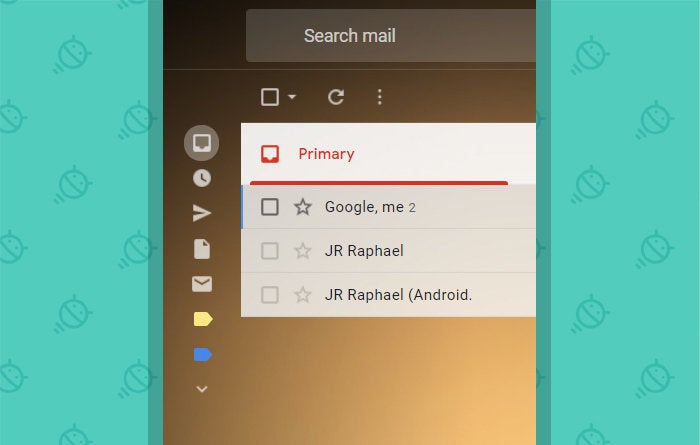
Pictures are worth at least 997 words in situations like these, so let me begin by showing you what my own Gmail inbox looks like right now, in the days since I moved back into it from Inbox and set out to make the transition tolerable:
 JR
JR
(Click image to enlarge.)
Quite a change from the default Gmail view, eh? As you can see, I've stripped away most of the superfluous text and buttons and left only the elements I actually need for my day-to-day email management. Some of what I removed is just straight-up clutter — elements like the Google app icon and notification counter, typically in Gmail's upper-right corner, and all the terms and policy silliness in the site's footer — while some of it is legitimately functional stuff that I'd just as soon not have on my screen, such as the giant "Compose" button that normally resides in the site's upper-left area.
Since I almost always use Gmail's keyboard shortcuts for functions like composing new messages — which means I simply hit the letter "c" whenever I want to write a new email instead of messing with my mouse — the "Compose" button was completely redundant for me and accomplishing little more than creating clutter.
So how can you go about enhancing your Gmail inbox interface in a similar manner? Let's break it down:
Step 1: Make sure you have Gmail's keyboard shortcuts enabled and configured the way you like
Part of the super-minimalist approach I've created relies on the fact that I use keyboard shortcuts for common Gmail commands, as I mentioned a moment ago. If you're gonna eliminate the on-screen buttons for things like composing a new message, you'll need to first be sure you're comfortable using the associated keyboard shortcuts. Otherwise, you'll find yourself in quite the awkward pickle (and believe you me, "awkward pickle" is not a positive description for anything).
So first and foremost, confirm that you have keyboard shortcuts enabled: Go into Gmail's settings, scroll down the page until you see the "Keyboard shortcuts" option (within the "General" tab that comes up initially by default), click the button next to "Keyboard shortcuts on," and then scroll down and click the "Save Changes" button at the bottom of the page.
Once Gmail reloads, you can see a full list of available keyboard shortcuts by pressing Ctrl and ? from anywhere in the site.
If you really want to get wild, go back into Gmail's settings, click the "Advanced" tab at the top, and click the "Enable" button next to "Custom keyboard shortcuts." Once Gmail reloads, go back into the settings again and look for the new "Keyboard Shortcuts" tab along the top bar. There, you can configure your own custom actions for getting around Gmail — including Inbox-like commands such as "i" for returning to your inbox from anywhere or "ESC" for closing an email and going back to a message list.
Step 2: Optimize and condense your left side panel
Before we start stripping away interface elements, we need to take a few minutes to clean up some basics. Gmail's hefty new left side panel is a perfect example: In my minimized setup, you'll notice that the panel itself is condensed — meaning you see only icons for each present section instead of seeing a meaty column that takes up tons of space.
 JR
JR This change is easy to accomplish: Just click the three-line menu icon in the site's upper-left corner. That'll lock the panel down into a condensed form — something that's a pure gain and no loss move, as the panel still automatically expands and shows its full contents whenever you hover your mouse over it, anyway.
The next thing you might notice about my configuration is that the list of icons in that panel is significantly shorter than what Gmail gives you by default. This is another easy modification to make: Hover your mouse over that panel — and if you see the word "More" at the bottom, click it so that all of your labels and categories will be exposed.
(If you have the Hangouts/chat module still lingering beneath that area, think about whether you actually need it there. If not, go into Gmail's settings, click "Chat," and disable it. If you do want to keep it, you'll have to slide the line above it downward in order to access your full labels and categories list.)
Now, think carefully about which labels or categories you really click on regularly or need to be able to see from your main inbox view. For me, it came down to a small handful of basics: the inbox itself, my snoozed messages, my sent messages, my drafts, my All Mail area, and then the labels for the reminders and saved articles features I created via my crafty Inbox-to-Gmail feature hacks. (And yes, I realize I could access any of that stuff via keyboard shortcuts as well, but I've come to appreciate having some of those icons on-screen in that area. Plus, I need to be able to access the fully expanded side panel sometimes, and it makes for a more visually balanced look to have at least a handful of icons present in its collapsed form.)
For any labels or categories you determine you don't need to see all the time, click the associated icon, drag it down below the "Less" marker, and let go. Gmail should then move it down into that area of the panel.
Once you've done that with all the icons you don't need in your primary view, click the word "Less," say hocus-pocus for good measure, and bam: Gmail will hide the lower part of the panel completely out of sight. Now what you're left with is a condensed and far less distracting list — and whenever you need to get to something that's hidden, all you have to do is hover over the side panel and click the "More" command to reveal every label and category available.
Step 3: Hide the new right side panel
One more side panel to push out of your hair: that new narrow one on Gmail's right side, with links to open widget-like versions of Calendar, Keep, and Tasks. Unless you use that all the time, click the small right-facing arrow in the bottom-right corner of the Gmail site. That'll hide it and neaten up your interface even more — and whenever you want to access that panel, you can just click the left-facing arrow in that same corner to reveal it.
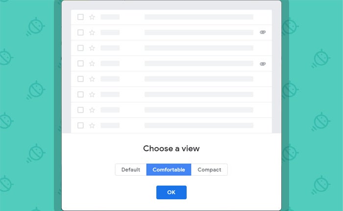
Step 4: Think about your display density
Gmail's latest incarnation offers a few different options for display density, and the default setup puts a lot of extra info on your screen by way of the large thumbnails it creates for attachments and other bits of email-contained info.
While that model is actually Inbox-inspired, I find it to be a clutter-creating change, personally. Those thumbnails are useful to me on mobile — where the Gmail app doesn't currently offer them, for some reason — but on the desktop, they're mostly just distracting.
If you feel the same way and would like to clean up your inbox's look by eliminating those thumbnails, click the gear icon in Gmail's upper-right corner, select "Display density," and try the "Comfortable" view. It'll keep things nicely spaced out but will remove the attachment tiles and give your inbox a more uniform appearance.
 JR
JR Step 5: Work some CSS-modifying magic
All right — now that we have those preliminary fixes out of the way, we'll get to the big part of our effort. The bulk of my Gmail interface enhancements are made possible by a powerful (and free) Chrome extension called Stylebot. Stylebot gives you a relatively simple way to modify any website's CSS — a special language that controls many aspects of a page's appearance — in order to hide or move elements as you wish.
Now, it probably goes without saying, but you can really screw up the way a website looks if you aren't careful with this tool. But any changes you make are limited only to your browser, and you can clear them out and start fresh anytime with a single click of your friendly neighborhood mouse. So there's no real potential for lasting or meaningful damage and no major cause for concern.
The easiest way to use Stylebot, once it's installed in your browser, is to right-click on any elements you want to change — like the Gmail logo in the site's upper-left corner, for instance — and then select "Stylebot" followed by "Style element" in the menu that appears. That'll pull up the extension's control panel, which has a plethora of options for re-styling the element you've selected.
The option most relevant to our purposes here is the "Hide" command, located in the "Layout & Visibility" section of the extension's control panel. Click that, and you'll see the element you've selected magically vanish from the page. (Ooh! Ahh! Etc.)
Other relevant options include margins, which effectively allow you to shift an element's placement on the page, and height and width, which can let you shrink an element down in size. Also worth noting are the commands for undoing and for resetting a page and removing all of your style changes. (Disabling or uninstalling the extension will also immediately remove any changes you've applied.)
The simpler way: This is a lot to work through and tinker with, I realize — so if you want to just try using the exact setup I created, I've published my custom Stylebot code here. All you have to do is copy the code from that page and import it into the Stylebot extension on any computer where you'd like the modified interface to appear, and it should give you the same interface enhancements you see in my inbox screenshots. And if you try it out and then decide you don't like it, no biggie: Just use Stylebot's option to reset the Gmail page — or disable or uninstall the extension entirely.
Step 5: Apply some finishing touches
Your inbox is startin' to look pretty darn spiffy, right? We'll just make our way through a couple of quick finishing touches, and then you'll be all set.
First, for whatever labels you left visible in your freshly condensed left side panel, consider applying custom colors so they'll (a) look nicer and (2) be immediately recognize to you at a glance. To do this, simply hover your mouse over each label and click the three-dot menu icon that appears to its side. Then, hover over "Label color" and select whatever color seems most appropriate for each one.
Finally, consider applying a calming theme that'll complement your new inbox aesthetic. Click the gear icon in Gmail's upper-right corner and select (yep, you guessed it) "Themes." I'd suggest scrolling down til you see the "More Images" thumbnail and clicking on that; doing so will reveal a whole host of lovely photos from which you can choose, including the one you see in my own inbox screenshots.
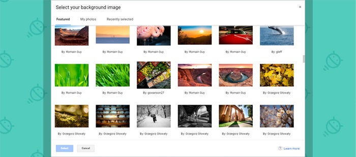 JR
JR The key to making an image work well as an inbox background resides in two easily overlooked tools at the bottom of Gmail's main theme-picking box (which you'll see once you select and apply an image). The first, immediately to the left of the "Cancel" button, allows you to apply any amount of blur to your image — something that can go a very long way in making a photo blend in pleasantly without being overly distracting.
The second, one icon over from there, gives you the ability to apply a vignette to your image — which basically makes it darker from the corners moving inward. That, too, can make a world of difference in transforming an ordinary image into a perfect and not overly attention-demanding inbox background.
By default, Gmail will usually style the colors of your various inbox elements to match the image you select (much like what we see on Android, in recent releases). If you aren't thrilled with the way things look, you can toggle between a light and dark text background via the third icon on the main theme-picking box (a gray square with a white "A" inside of it).
And with that, my dear compadre, your Gmail inbox should be looking immaculate. You are primed and ready for optimal email management. All that's left now is to deal with those mountains of dad-gummed messages that keep piling up.
Sign up for JR's weekly newsletter to get more practical tips, personal recommendations, and plain-English perspective on the news that matters.

Tidak ada komentar