How to make an East Coast private school look cool

As it looks ahead to its centennial in the coming decade, the university commissioned design agency Pentagram to create a new visual language for its next chapter. In 2018, of course, U.S. institutions of higher learning are business entities, vying for students’ dollars, and by revamping its look, Quinnipiac sought to telegraph that aspirational sense of place. The United States is one of the most expensive places to pursue higher education in the world. To persuade parents to spend their savings at its school instead of, say Yale and Harvard, Quinnipiac is positioning itself as every bit as elitist as the Ivies–while updating its look to win cred with Gen-Z kids.
Name-dropping
As in sports, fashion, publishing, and arts institutions, logos and brands play an important role in conveying prestige to customers and potential audiences. Institutions of higher education are no exception. In an increasingly hyper-visual digital landscape, it can also be difficult to avoid the pitfalls of sameness. “One of the things that sort of bothered us was the aspect that if you’re going to an elite college, you must feel and look elite,” says Pentagram partner Eddie Opara, who led the rebranding. While other big universities, including the University of California system, have been criticized for overtly trendy branding, Opara believes more schools could rethink the stodgy, old-fashioned sans-serifs and seals that have become the norm.
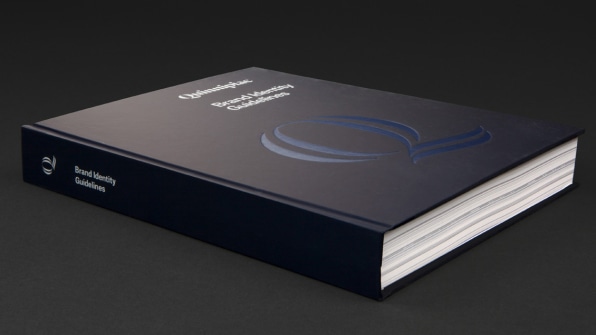
With the university’s previous logo, set in a nondescript sans-serif font, “The visual tone of voice was not appealing to that type of higher standard education,” he says, and his team looked at the possibility of dropping University from the formal branding assets–“a bit like how Harvard or Yale or Stanford look at themselves verbally. People do not say ‘Stanford University.’ They say Stanford. That type of voice, of importance and tradition, needed to be better relayed,” he says. Owning its name, the new revamped brand sheds its qualifier and stands on its own, set in Portrait Q, a bold and weighty, specially customized version of the neoclassical serif font Portrait, designed by the foundry Commercial Type.
A logo for the ages
A university that starts with the letter “Q” is unusual, so Opara decided to capitalize on it for the logo. Previously, the university had used Qu (inconsistently) as an abbreviation in various materials, but Opara felt was redundant: In common English, the letter Q is rarely not followed by the letter u, and in terms of pronunciation, “Qu” reads the same as the letter Q on its own.
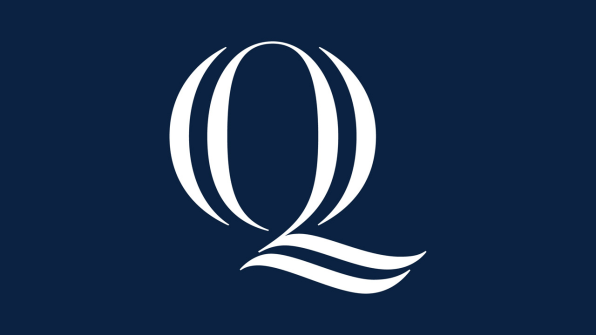
Opara’s team decided to heighten the “rarity, the distinction of the letter Q,” by creating a bespoke, scripted monogram, which appears in calligraphic and solid variations, for versatile use on apparel, print stationery, and online collateral.
New-school plaid, reinvented

“As a graphic device, it’s not meant to be static,” he says. “You can actually play with it, crop it, rotate it, explode it, separate it out.” Translating a traditional pattern to a web-friendly aesthetic, Opara’s Quinnipiac plaid is a cheeky dismantling of East Coast prep, even as it leans in to evoke it–a winking and slightly irreverent take meant to please parents and students alike. With the new brand identity, he and the team are banking that the brand will not only serve to enrich Quinnipiac’s wider community, but become both a visual and intellectual symbol they’ll be proud to wear on their sleeve.
Tidak ada komentar