Here's how to make sure Hawaii's missile warning fiasco isn't repeated

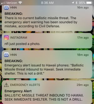
By now, most people have heard about the erroneous incoming ICBM alert in Hawaii. There's been scrutiny of the how the emergency alert system works and of how international tensions and the flight times of missiles can lead to accidental nuclear war. I'd like to focus instead on how the systems design in Hawaii led to this problem—a design that I suspect is replicated in many other states.
One possible factor, of course, is hurried design:
"We spent the last few months trying to get ahead of this whole threat so that we could provide as much notification and preparation time to the public," Miyagi said. "…I accept responsibility for this, this is my team, we made a mistake."
But the odds strike me as very high that the user interface was simply implemented by a web programmer, rather than being designed by a human factors specialist.
I have no doubt that it was a bad interface. As the New York Times writes:
Vern T. Miyagi, the administrator of the agency, said that during the drill, an employee—whom he did not identify—mistakenly pushed a button on a computer screen to send out the alert, rather than one marked to test it. He said the employee answered "yes" when asked by the system if he was sure he wanted to send the message.
First, you don't put the real button and the test button on the same menu. Second, asking people to simply acknowledge that they want to do what they just asked to be done simply doesn't work. This is very well known; it's even satirized in a W3C Wiki:
Dialog box
A window in which resides a button labeled "OK" and a variety of text and other content that users ignore.
This was a regular, end-of-shift drill. An employee—thankfully unnamed, since it wasn't this person’s fault—accidentally clicked on the wrong on-screen icon, then did what was normal practice: clicked OK (or perhaps typed "yes") to the confirmation screen, purely out of habit. After all, that's exactly what had to be done at every shift change—only this time, the result was accepting the wrong action.
And again, it was not the employee's fault. Don Norman said it well:
It is far too easy to blame people when systems fail. The result is that over 75 percent of all accidents are blamed on human error. Wake up people! When the percentage is that high, it is a signal that something else is at fault—namely, the systems are poorly designed from a human point of view.
And of course, using a different user interface for sending real alerts risks a different failure: when an actual emergency occurs, people are stressed out, worried about themselves, their families, and (in this case) the entire planet. The last thing you want is to have to think through something new and different; failure to send a necessary warning has its own, very serious consequences. This is why I say that a design like this should be created by a real human factors expert.
There's another issue here beyond the user interface problem: the total system. Once the alert was sent, there was no easy way to cancel it. It took 38 minutes to send the All Clear message because of alert system design requirements, per The Atlantic:
IPAWS notices have a specific format, which must be composed formally and in advance. Audio files for broadcast notices must be recorded or generated and uploaded. Often, this has to be done by special software on special equipment.
And alerts to users are limited to 90 characters, with no embedded media or URLs allowed. Fortunately, that is being changed. URLs? Sure—but your Web server better point to a really good content distribution network (CDN), because about 30 seconds after an alert like this is sent you're going to have a very large number of people clicking or tapping on it. The cell phone network will need lots of bandwidth, too, both to customers and to the (presumably internal) CDN.
So: we had a bad user interface that talked to an inflexible system, that had no pre-prepared cancellation message and was destined for a network that had very stringent limitations on what it could deliver to end-users.
Hawaii has implemented two-person authentication for real alerts. That's good, though I wonder how good a job they did testing the new code. I also caution that two people can be as habituated to the same end-of-shift rituals as one. What's really needed is a thorough, top-to-bottom review of the entire system starting with, but not limited to, the user interface.
Listing image by Getty Images
https://arstechnica.com/information-technology/2018/01/heres-how-to-make-sure-hawaiis-missile-warning-fiasco-isnt-repeated/
Tidak ada komentar