How to make trustworthy apps, when no one trusts tech anymore
Picture this: You’re walking down the street, and a total stranger comes up to you, asking if you’d like to save $20 off your monthly bills. You’re intrigued–who wouldn’t be? “Excuse me?” you ask. This total stranger again says that you can save $20 off your monthly bills, and adds that all you need to do is share your name, phone number, home address, and social security number. Oh, and you’ll also need to answer a couple identity-verification questions.
What would you do? No doubt, you’d walk away and dismiss the person immediately. Yet, this seemingly bizarre interaction is analogous to a wide range of experiences that we all have with many of our mobile and web experiences on any given day. We are constantly asked to share extremely personal information with companies of all shapes and sizes, from social networking to email to financial services and more. We voluntarily disclose our most personal information with web and mobile products just about every day of the year. Why? Because they’re convenient. And trust helps us feel good about these decisions–that we are not, in fact, dealing with some random stranger.
While we trust these companies to make our lives easier, it’s important to remember both how easily that trust can be broken and how once trust is broken it’s even harder to regain it. One only needs to look at examples where trust has been violated–Cambridge Analytica, Equifax, Wells Fargo, Uber, to name a few–to appreciate that trust, or lack thereof, can make or break your business. If you’re a business leader, and you’re not thinking long and hard about how to convey, deliver, and sustain trust, you should be. Trust doesn’t start and stop at keeping your user’s information safe. One of your most powerful levers is the role that design plays within your company, brand, and user experience.
Great design is a key ingredient in building trust for users, though not as a “one-and-done” proposition. Rather, designing for trust requires a holistic view, and constant (and I really mean constant) reexamination to ensure a successful and healthy relationship with your users. Reflecting on my own work and those of designers I admire, I’ve found that there are four tenets that guide designing for trust.
Try starting with a handshake (or high five)
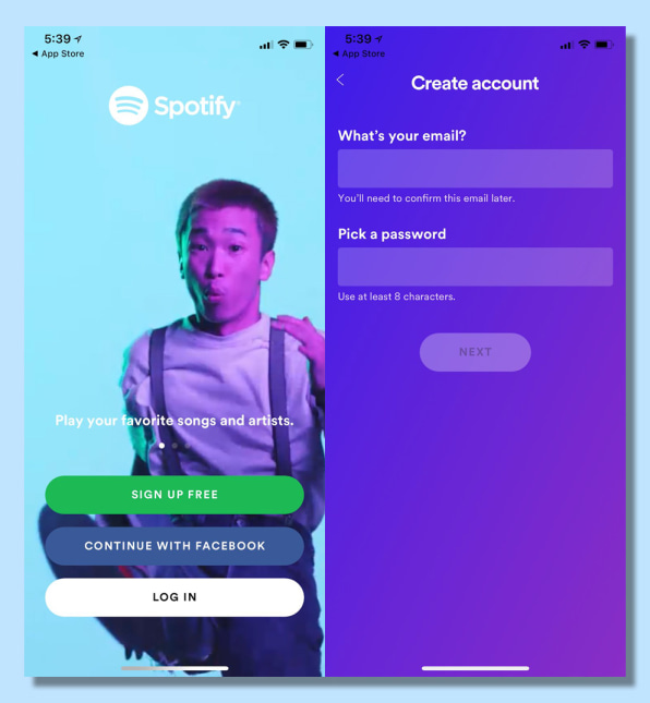
When meeting a new person, you’d probably shake their hand rather than launching in to kiss them; a handshake is the norm, it’s what your new acquaintance expects given social niceties and context. If you tried to get too close in that first interaction, you would subvert expectations, and not in a delightful way, but in a way that would make your new acquaintance feel wary if not outright alarmed. The same principle applies to design. While “be human” might seem obvious, it can be easy to forget that it takes time to build a relationship. You need to confidently and appropriately lead your users through a journey that starts with the digital equivalent of a handshake and then sequence interactions like you would in real life, or in a way that conforms to our shared expectations for appropriate behavior.

Go beyond a padlock icon
Trust can’t be earned with some visual shorthand like a padlock icon next to a payment flow. It’s important to think holistically and design with the full user experience in mind so that trust can be imbued at every step. This will ensure that your users’ experience is cohesive, enjoyable, and continues to exceed their expectations beyond day one.

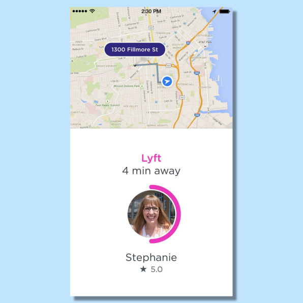
By telling us how far away this person’s Lyft is (using something easily understood such as minutes), the name and picture of the driver (humanizing the experience), as well as the driver’s star rating (showcasing that others enjoyed their ride), Lyft conveys a tremendous amount of valuable information in this one screen that instills trust in a user.
To Oxford comma or not? Doesn’t matter, just be consistent
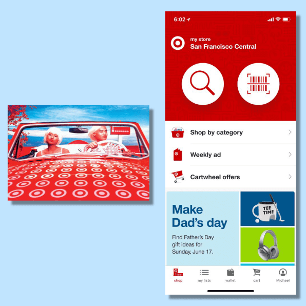
Similarly, you’ll want to keep things consistent across the users’ experience. From colors to style conventions to typography, standardizing the look and feel of your design is crucial to creating trust. These standards will immediately create an impression, and this impression will become an expectation. Deviating (unless you’re rolling out a major rebranding) will suggest some instability or amateurism–none of which screams “trust me with your personal data.”

Don’t wear sweats to a wedding
Just as making an effort with your personal presentation can be a mark of respect for others–you wouldn’t wear sweats to a wedding or job interview–ensuring that your design is thoughtful and appropriate demonstrates your respect for your users. Don’t forget spell check or to otherwise polish all your work. Your high standards and attention to detail signal that you take your users’ needs seriously, which in turn engenders trust.


Making trust core to your design practice and adopting these four tenets might not be an easy proposition at first, but they’ll pave the way for long-term rewards.
Michael Chanover is the vice president of design and user experience at NerdWallet.
Tidak ada komentar